We tend to think of words as the means through which we express our thoughts, and to a large extent that’s true. Yet I can’t help thinking that it’s more of a two-way process, in which the words available to us and the words we use also influence, and perhaps even limit, the way we think. With this painting – the first of my Powerful words pieces – I’ve tried to explore the influence that words have on our thoughts in the context of a particular detrimental thought pattern known as black-and-white thinking.
Thinking in extremes
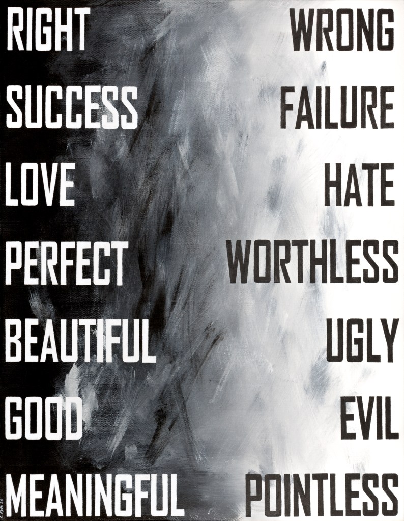
In psychology, black-and-white thinking – also known as all-or-nothing thinking, or dichotomous thinking – is classed as a cognitive distortion, or thinking trap. When caught in this trap, we see everything in extremes and there’s no room for nuance – it’s either right or wrong, success or failure, love or hate.
The problem with this distortion is that the positive extremes are fragile, and the slightest evidence against them causes an instant default to the opposite, negative extreme. The negative extremes are much harder to discount than the positives – this probably relates to the negativity bias that’s been pretty much hard-wired into human brains by evolution (I wrote about this in my post about my Powerful words project) and pushes us to focus on and remember negative experiences. As a result, black-and-white thinking tends to leave us seeing the worst in everything and feeling defeated and hopeless.
The words we have available to us to articulate our thoughts – at least in English – often seem to encourage dichotomy in our thinking. The extremes have easy labels, but the nuances between are not easily described with single words. As a result, it’s easier for our energy-conserving brains to default to the categorical labels at either end of the spectrum.
Perhaps it’s not only about the words themselves but also about the way our brains process language. When we hear, see or think of a word, it activates a whole network of associated ideas and corresponding words. Often, one of the strongest associations is what we think of as the opposite. Imagine playing a word association game where you’re given a word and you have to respond with the first word that comes to mind. If you hear the word right, there’s a good chance your reflex response will be wrong. If you hear black, there’s a good chance you’ll say white.
On top of these features of language and the way we process it, the pervasiveness of social media seems to nurture dichotomous thinking. Character limits and the drive to grab short-lived attention mid-scroll encourage use of simple, extreme messages and make nuanced opinions unappealing or ineffective. The result is an entire digital environment in which everything is presented as being at one extreme or the other – people are idols or devils, societies are utopian or dystopian, beliefs are sacred or absurd. Many of us spend so much time in this digital ditch of false dichotomy, it’s no wonder we tend towards seeing everything as black or white.
The idea of the painting is to visually represent the mismatch we create between our thoughts and reality when we engage in black-and-white thinking, highlighting the fact that the words provide a concrete representation of the extremes and help to crystallise dichotomies in our minds. The letters are pure white and pure black to symbolise the dichotomous extremes they represent. The messy gradient from black to white in the background represents the reality that underlies these words – the reality that the extremes are rarely true or attainable, and there’s almost always a confused, uncertain middle ground.
Choice words
The words I chose to include are a mix of some obvious extremes (right and wrong, love and hate, beautiful and ugly, good and evil) and some that I personally find particularly problematic or interesting. But deciding on the exact opposites to use was not as straightforward as I had imagined.
For example, I particularly wanted to include perfect as one extreme, because perfectionism in various guises plays a big role in the way I navigate the world. But what is the opposite of perfect? One word that comes to mind reflexively is imperfect, but that’s not a clear opposite – it could be interpreted as just short of perfect. I realised there doesn’t seem to be a clear-cut opposite – possibilities, according to a thesaurus, include words such as terrible or flawed or defective, but these don’t seem quite like opposites to me. I settled on worthless because my concept of perfect is tied up with the intrinsic value of something, so a lack of perfection is equivalent in my mind to a lack of value, or worthlessness.
This thought process made me realise that these kinds of dichotomous categorisations may well differ between people, according to the way they see the world and the experiences they’ve had. This is an interesting thought given that black-and-white thinking is associated with mental health conditions. Do people’s interpretations and processing of dichotomous words influence how susceptible they are to black-and-white thinking patterns and determine the effect this type of thinking has on their mental health? Does categorisation and processing of words differ between people, so that the potential for dichotomous thinking also differs?
Design decisions
In addition to the choice of words, two other main decisions shaped this painting. One was which typeface, or font, to use for the words. I wanted something plain and bold to reflect how blunt and categorical the words are. The typeface also needed to have narrow letters so that the longer words would still leave an empty space down the centre to emphasise the distance between the extremes and the gradient between them.
The other decision was the medium. The image could easily and much more quickly have been created digitally, but I decided against this. One reason was that a digital image would have been too perfect – with the ‘perfect–worthless’ dichotomy in mind, I liked the idea that a hand-painted version would have inherent flaws, such as an imperfect gradient, and wobbly lettering, that would reflect the unattainability of the ideal extremes. In fact, when I came to paint the gradient, it became clear that it definitely shouldn’t even be a smooth gradient because in reality, the grey area is always confused and complex.
Another reason for painting by hand was that I knew the lettering would be time-consuming, and I wanted to use the time to reflect on the ideas I was depicting. I thought perhaps the physical involvement and the time to think could even re-wire the black-and-white thinking patterns in my own brain to some extent, as a kind of therapy. The realisation that dichotomous pairs of words might differ between people was one reflection that came from my time working on the piece, so I feel like this approach had some of the effect I wanted.
Final thoughts
Though the overall concept of the painting is simple, I hope that reflecting on what it brings to mind will reveal subtle and complex aspects of our thinking, our use of language, and how this is influenced by our experience and wider society. Given the negative effects of black-and-white thinking on mental health, I also hope that bringing these reflections into awareness could even help to disrupt unhelpful patterns for some people.

Leave a comment