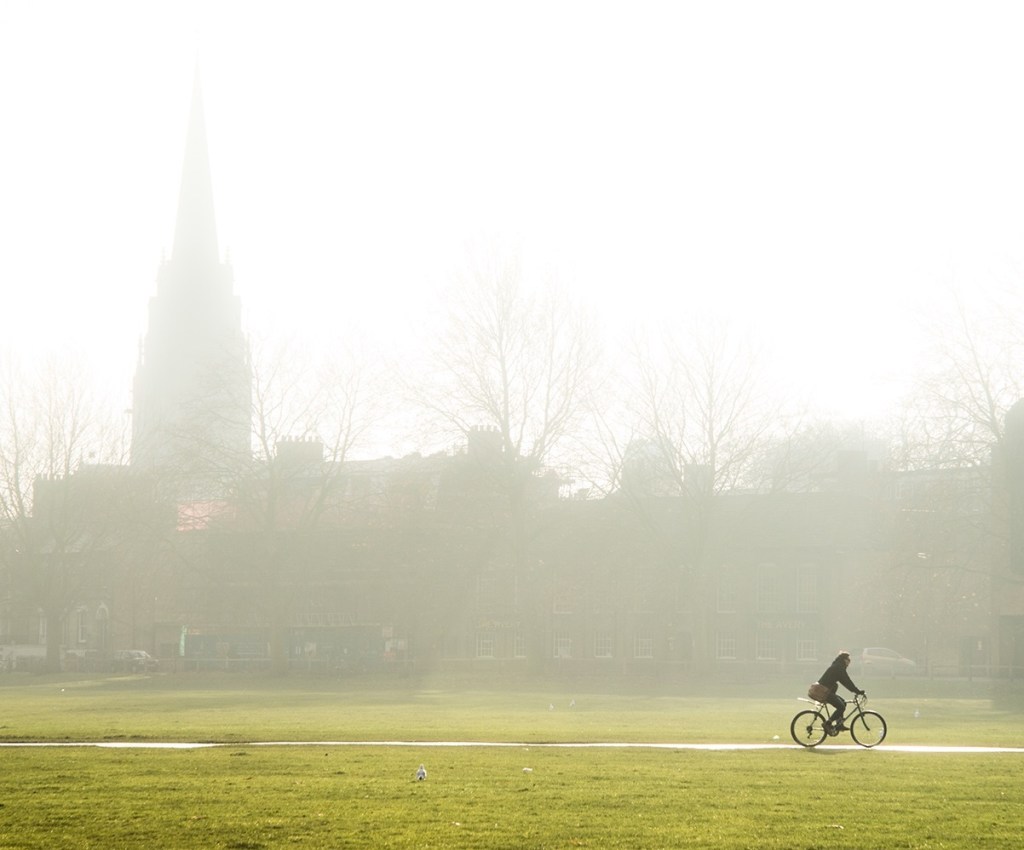
A lone cyclist, making his way into the city on a misty morning. One of my favourite photographs, made in 2013. I love this photograph because it has atmosphere. The cyclist seems isolated and you feel remote from him as the viewer, yet you know how he feels. There’s an overall feeling of peace, but there’s also a balance and tension that creates a sense of movement and urgency – where’s he going? It seems like a simple photograph, but when you look into it closely, there are some interesting things happening.
Two distinct layers
The mist has a fair amount to do with the atmosphere. This image wasn’t made early in the morning, it was just a foggy day, but it conjures up that feeling of an early winter morning. I used the mist in a very deliberate way to maximise its impact. I positioned myself so that the people walking and cycling along the path were just in front of the haze so that they were dark but everything behind them was hazy. This creates two distinct layers – the background is effectively flattened to a single layer dominated by the misty outline of the city scape, and the cyclist is in front. This separation, along with the fact that no other people appear in the frame (I was there some time to wait for the perfect subject and no-one else to be in my viewfinder), this creates the feeling of isolation and peace.
The most interesting part of this photograph to me though is that, although there’s essentially one point of focus – the cyclist – it’s dynamic. There’s a trade-off between balance and tension, and this is all down to the composition.
Balance
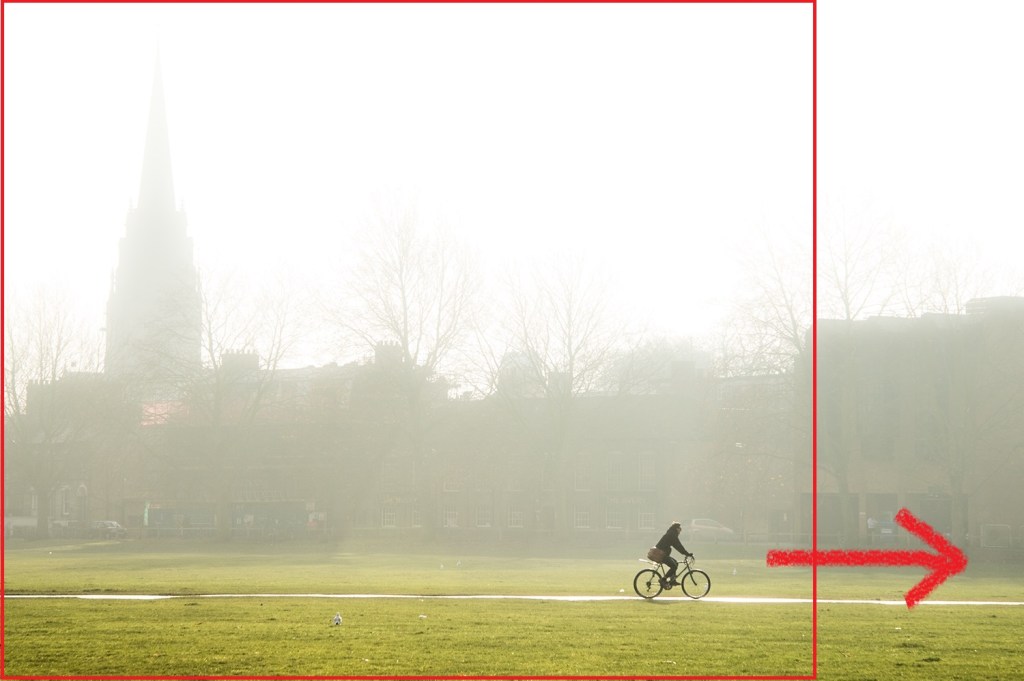
The cyclist is placed precisely on the right hand third of the frame (below), adhering neatly to the classic rule of thirds, at least in one dimension. However, the placement of the cyclist breaks more ‘rules’ than it adheres to, and this is where it starts to get interesting.
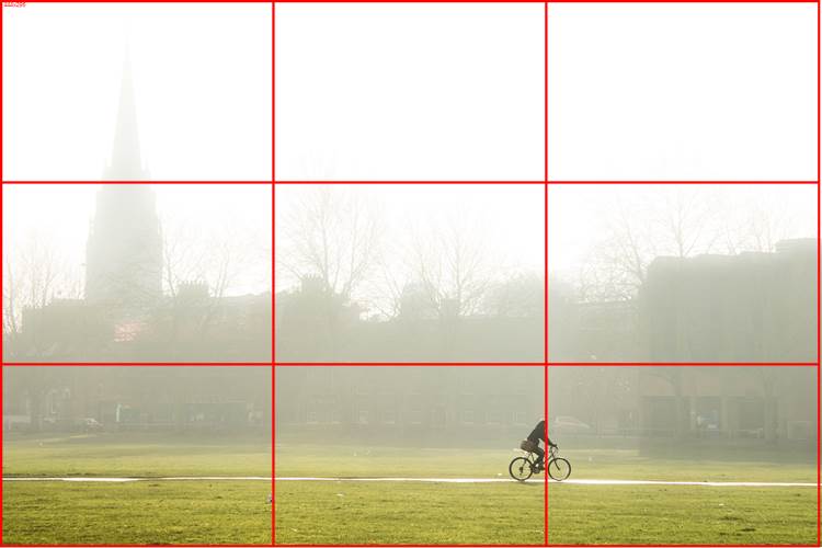
The cyclist is not on the vertical third of the frame, but is low. Had he been placed on the intersection of thirds a little higher, there would have been too much foreground. What allows this placement to work is the compositional element that, for me, trumps everything else – balance.
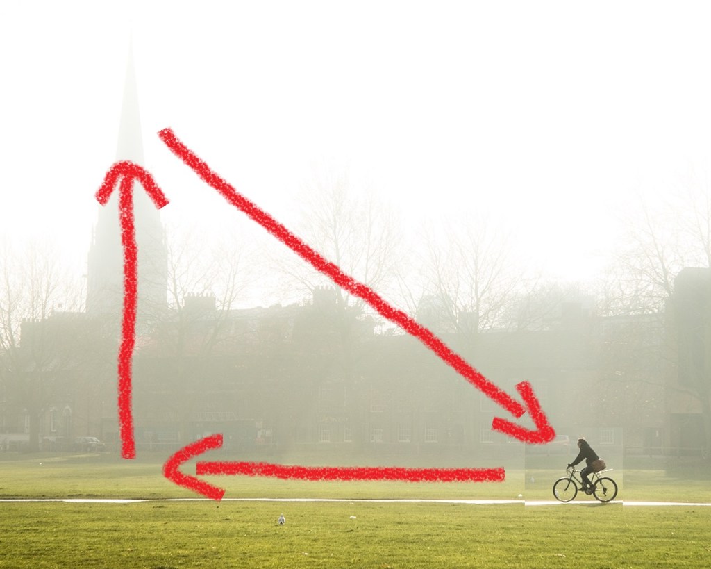
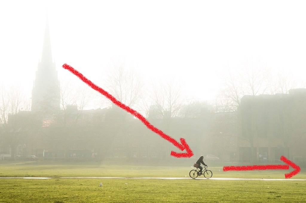
The misty church spire provides the balance for the cyclist here. This works in two ways. First, their relative positions create an implied diagonal in the image (below), and the spire balances out the visual mass of the cyclist. I’ll come back to that diagonal in a moment.
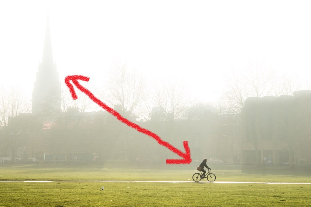
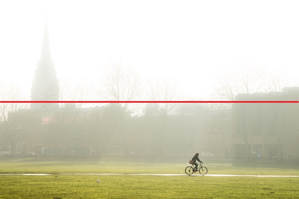
Second, they serve the same function in the top and bottom halves of the image. If you divide the frame into two, it’s almost exactly divided along the top of the buildings in the background, creating a light top half and darker bottom half (below). The church spire and the cyclist are both darker blocks in their respective halves of the image, so they draw the eye, emphasizing the diagonal between them.
Tension
The placement of the cyclist not only creates the balance with the church spire, but also creates tension. Rather, the direction he’s facing creates tension. The rule book says to give moving subjects space to move into the frame, and the cyclist facing the edge of the frame implies movement that pulls the eye out of the image. So why does this rule-breaking work here?
To think about this, let’s turn the cyclist to face the other way. I’ve done that (very crudely) below, and cropped the frame a little at the right – that crop is needed to maintain the balance between the church and the cyclist, and that’s an important clue to what’s going on here.
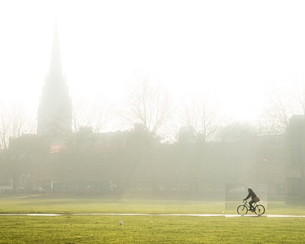
When the cyclist’s facing the opposite direction, it’s a very different image. The diagonal between the spire and cyclist is now joined by a horizontal underneath that’s implied by the cyclist’s movement. Effectively, these implied lines create a triangle (below), leading to a closed image that’s well balanced but without much tension.
Going back to the original, that could be cropped in the same way to create a squarer frame.
The balance between the cyclist and church spire is still there, but the image doesn’t work, because the cyclist is too close to the edge. That triangle is still there, but the movement of the cyclist away from it means it’s just an empty space in the image.
Put that space on the right back, though, and the cyclist suddenly has space to move into (below). What’s happening here is that the diagonal between the church spire and cyclist implies a ‘frame within a frame’, and the space to the right of that is now sufficient for the cyclist to move into.
Rather than creating the triangle, the diagonal and the horizontal movement creates an open line that adds dynamism, creates tension, and leads the eye right across the image in the direction that the bike is going. This line creates movement and that sense of urgency.

Leave a comment