I’ve been continuing my exploration of out-of-focus photography to understand whether this approach can be used to create photographs that do not have a recognisable subject but are instead only about the visual experience. Before, I used flowers but decided the images were too recognisable. This time, I decided to try a subject that’s more abstract to start with – architecture.
I learnt a lot, but first , here are my five favourite images (click to view them larger):

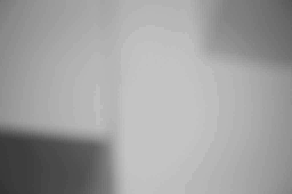
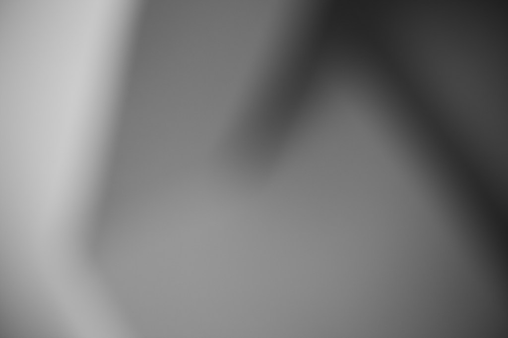
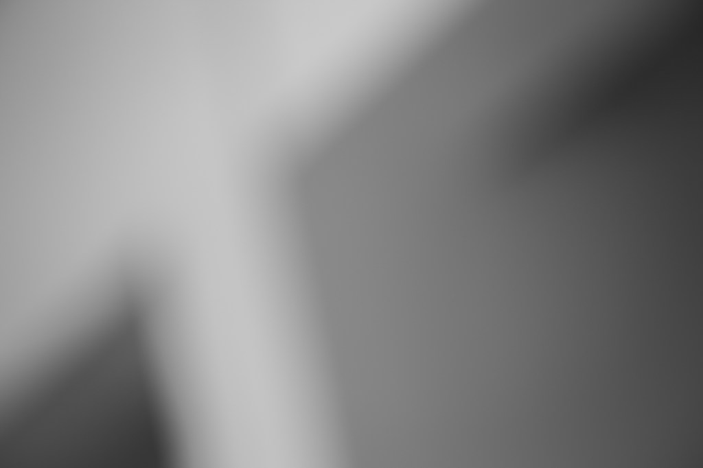

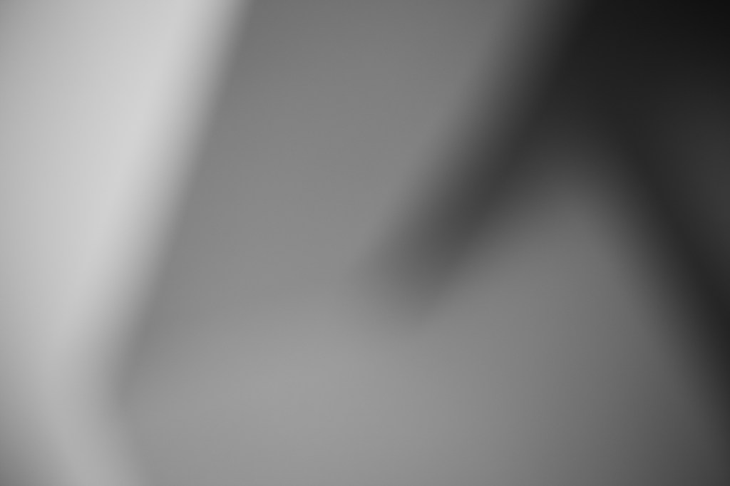
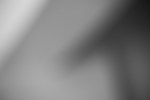
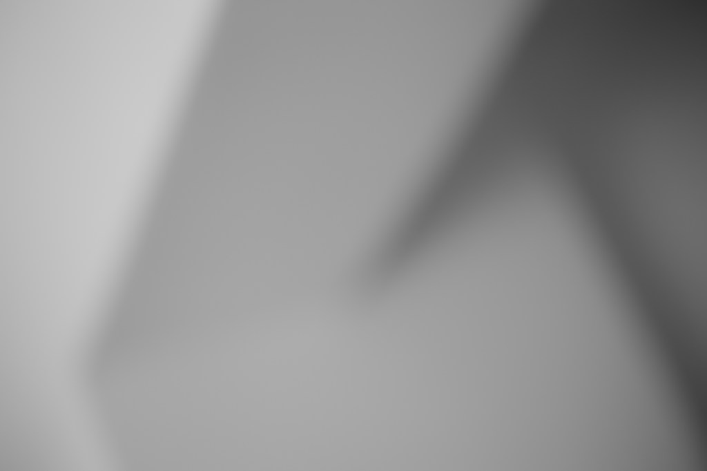
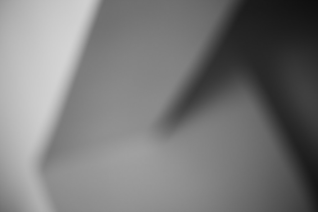
With these images, I got much closer to what I had in mind for this out-of-focus concept than with the flowers. These images are soft blends of light and shadow that fade into each other, yet the shapes still make for geometric compositions, and my intent here is all about balancing the shapes, lights and darks. I still find it difficult to disconnect these images from the original scene, but I suspect that’s because I know what it was. To you, I’m guessing (hoping) these are just abstract.
Making this set of photographs was about more than just creating final images though. It helped me to learn a few things about out-of-focus photography that will be useful for developing this project.
Defocus then defocus more
I took many photographs with the lens defocused to different extents, and with a subject that was much simpler than the flowers, it became obvious that what I was seeing through the viewfinder was not what I was recording. This could partly explain why the flower images were more recognisable than I expected. I was using my Canon EOS 6D, which has an optical viewfinder, and I discovered that the sensor recorded a lot more contrast than I could see through the lens. To get the kind of defocused look I was after, I had to defocus so much that what I was looking at through the viewfinder was essentially white.


This was a clear reminder of how the sensor records things differently to how the eye sees them, and made me realise just how out of focus things need to be to get the effect I want. The trial and error needed with an optical viewfinder is, of course, removed when using a camera with an electronic viewfinder, which I have switched to (a Canon EOS R6) since capturing these images. With an EVF, the preview is exactly what the camera will record, which will be helpful for continuing this out-of-focus project.
Size matters
Making images of a subject with such clear lines also made me see clearly how much the visual effect of the final image depends on the size at which the image is viewed. This dependence was immediately apparent when I got the images into Lightroom and I switched between thumbnails and full screen – images that I liked as thumbnails didn’t seem to work when I viewed them larger and vice versa.
The smaller the image appears for the viewer – whether a result of the physical size or the distance between the viewer and the image – the more defined the lines and shapes appear. The larger the image appears, the less defined the shapes and the more abstract the composition.
This is a particular problem with digital viewing because the size of the image can be changed at will and depends on the size of the display it’s viewed on. These images will look quite different on a phone screen to how they’ll look on a large monitor. As the image creator, I have no control over how the viewer sees the image, so I cannot control the final visual effect.
This is an interesting artistic point in general because for much of history, artists have been able to choose the scale of their work with a final effect in mind – a huge canvas for a dramatic, domineering painting, perhaps, or a small-scale sculpture to say something about the character of the subject. The modern ability to view works of art through a screen removes this size element and (in combination with other factors that are lost) can drastically alter the viewing experience that the artist intended.
After effects
Of course, the final effect of the images is also strongly determined by what’s done to them in post-processing. Thinking about how the extent of defocusing affects the contrast in the image and, in turn, how defined the shapes are and how recognisable the subject is, I wondered whether processing settings could be used to artificially ‘defocus’ images. I played around with the contrast, clarity and dehaze settings in Lightroom, all of which basically alter the differential between dark and light areas.
Reducing the contrast did reduce the definition of shapes to some extent, but clearly does not have the same effect as defocusing more at the time of capture. The areas of shadow, for example, are diffused further by defocusing, whereas their size does not change in post-processing, only their contrast with the lighter areas. Removing contrast from a more in-focus image creates a unique look with more defined shapes but less contrast. Does this reduce how recognisable the subject is? It’s difficult to say with these images because the subject is quite abstract anyway – it might be worth trying with the flowers to get a better idea.


Knowledge for next time
All in all, making these images and working on them has been really interesting. It’s made me see that the final visual effect is the result not only of the composition and how defocused the lens is, but also how the contrast is adjusted in post-processing and the size at which the final image is viewed. This will be useful to keep in mind the next time I’m photographing for this project because I can think about how these factors will come together to create the final effect and decide what I need to capture to work with.

Leave a comment